Are you looking for a fun, no-prep graphing activity?
As you are gathering math activities for the coming school year, it always helps to have a few no-prep activities that you can fall back on. Or sometimes you just need a fun and easy assignment to break up the routine.
Even better, it is helpful to have a backup graphing activity that is just as easy to do online as it is in person!
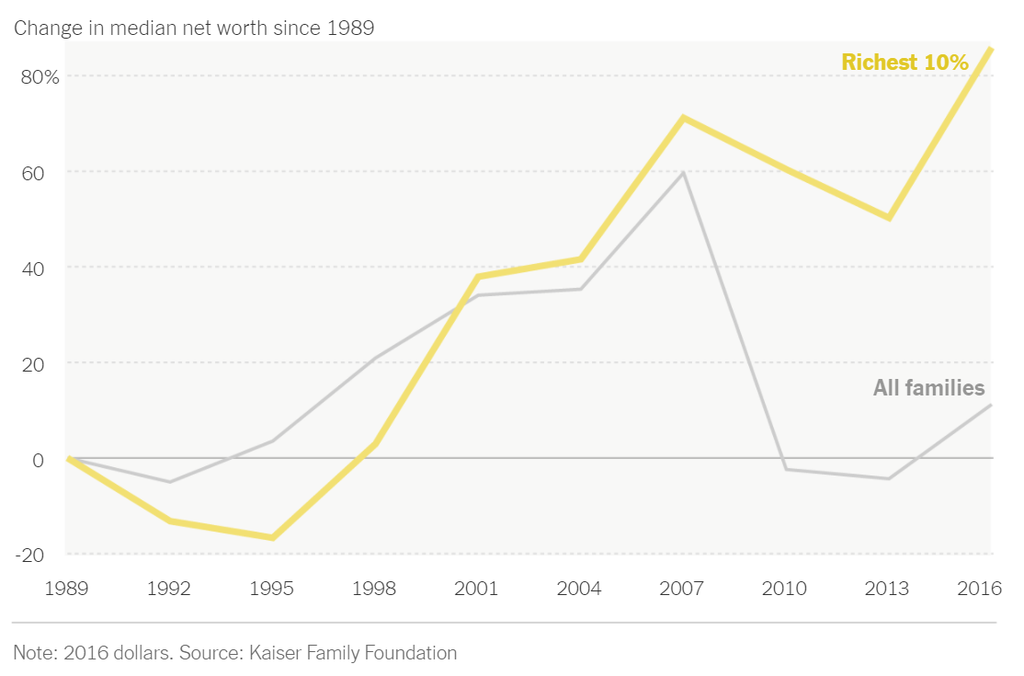
What’s going on in this graph?
Did you know the New York Times has a section dedicated to education, called The Learning Network? It is a fabulous resource for teachers! The Learning Network has a column titled “What’s Going On in This Graph?” The column is a collection of graphs from New York Times articles.

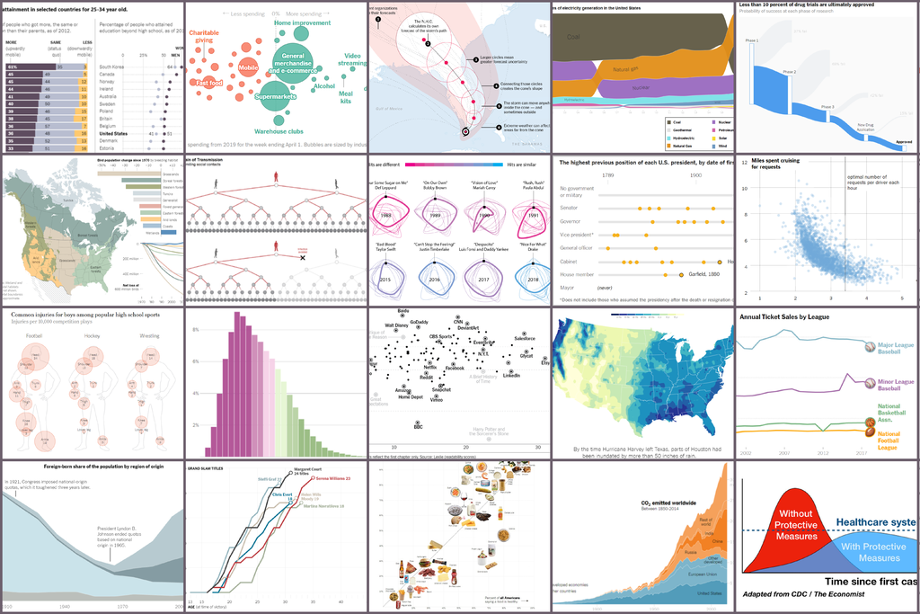
As you can see, the “What’s Going On in This Graph?” column has a wide variety of graphs and visuals. It is a free learning tool that is easy for teachers to access. You can present your students with many different types of data visualizations.
Since the graphs are curated from New York Times articles, the data is from actual case studies. Instead of providing your students with sample graphs, you are giving them graphs based off of real data.

How to use this to create a fun graphing activity
When teaching, share the graph on a screen or embed the link in a posted assignment. Because the graphs span a wide range of current events, you can choose topics that are relatable or allow the students to find a graph on the website that sparks their interest.
If one of your goals is to infuse your course with more data analysis, using these graphs as a bell-ringer with an open-ended question is a fantastic way to practice a few minutes each week. Ask students to identify the primary trends and any notable disruptions. Use the task to bolster collaboration or to teach students to write well-constructed answers to Free Response Essays or Data-based Questions.
It doesn’t get any easier than this to teach a habit for identifying a claim supported by data! Your students will soon approach every graph by stating the trend and defending their claim with the information available.
You can add to this fun graphing activity as much as you want. For example, you might ask students to draw a predictive graph for data that might be collected in the future for the same topic, sharing and defending their conjectures in small groups. Since graphs from The Learning Network come from case studies, students can dig deeper to find out more about the real-world issues related to the data presented.
For more guidance on teaching with the “What’s Going On in This Graph?” column, click here to watch a webinar provided by The Learning Network. The webinar discusses several different ways teachers have used this fun graphing activity in their classrooms, both in-person and online.
