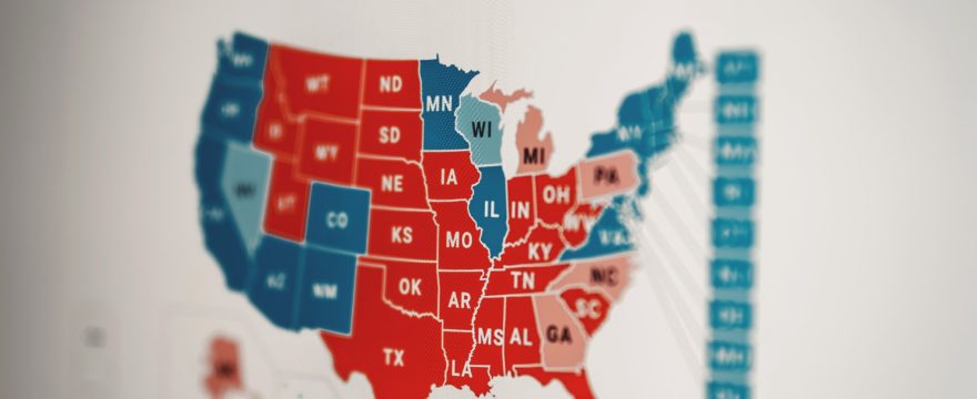
Have you ever looked at a presidential election outcome map of the United States that is colored red and blue to show which states voted Republican or Democratic? You were looking at a choropleth map!
A choropleth map is one of the best ways to visualize data related to a certain geographical area. Fortunately, creating a choropleth map is easy, and is an activity that students can do either in person or online.
What is a choropleth map?
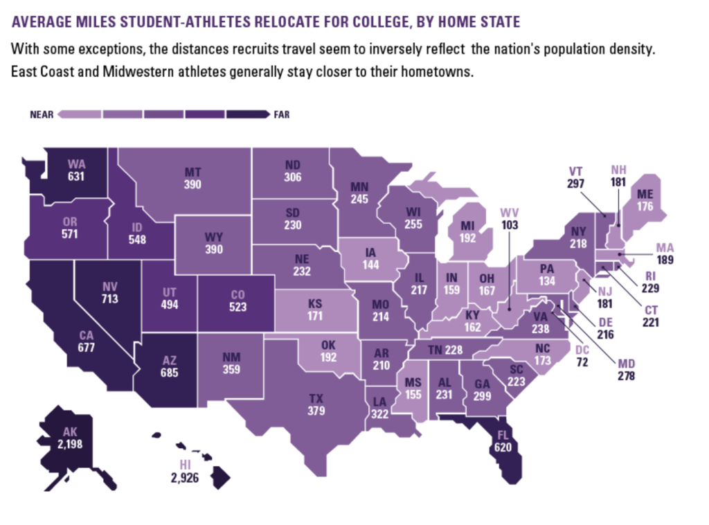
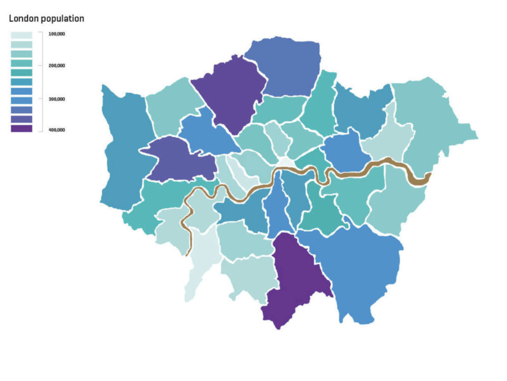
Choropleth maps use different colors to show data distributed over divided geographical regions. They are very useful for showing patterns and trends over large areas.
Typically, choropleth maps are only used with a few normalized values. Here are some of the most common:
- Density
- Proportion
- Rate of change or growth
The way the choropleth map is color coded may change depending on what kind of value you are using. For example, a choropleth map showing density may use a progression of shades of the same color to show increased density. Meanwhile, other choropleth maps may use multiple colors.


Tools for creating a choropleth map
Choropleth maps are very simple to make! First, you will need a dataset that can be visualized using a map. For example, you could use a population density dataset. Once you choose your dataset, you will need a blank map of the area and colored pencils or markers.
That’s it! You can either create a color key for your students, or allow them to come up with their own color key for the map.
If you prefer your students to make their choropleth maps online, there are several different online tools they can use. All of these tools are free or have a free basic version, although you might want to upgrade to one of the paid plans for more customizable options.
You can also create basic choropleth maps using Excel or Google Sheets. Click here to watch a tutorial on creating map charts in Excel.
If you are still looking for more data activity ideas, click here for my blog on five creative data visualizations!
