One of the reasons students get bored with science or math is because they fail to see how it connects with reality. How are math and science important in day-to-day life?
Well, one of the best ways to connect math and science to real-world events is through natural disasters. Hurricanes, earthquakes, tornados, floods…all of these natural disasters are science-based events. Furthermore, you can track their progress with math.
Although there are many natural disasters to choose from, one of the most obvious choices in the United States is wildfires. The western states, especially California, have suffered devastating losses due to wildfires. You can use the data from these wildfires as an opportunity to share how science and math are very important in tracking natural disasters, by connecting the wildfires to climate change, and by using fire data reports as datasets for line graphing exercises.
1. Connections to Climate Change
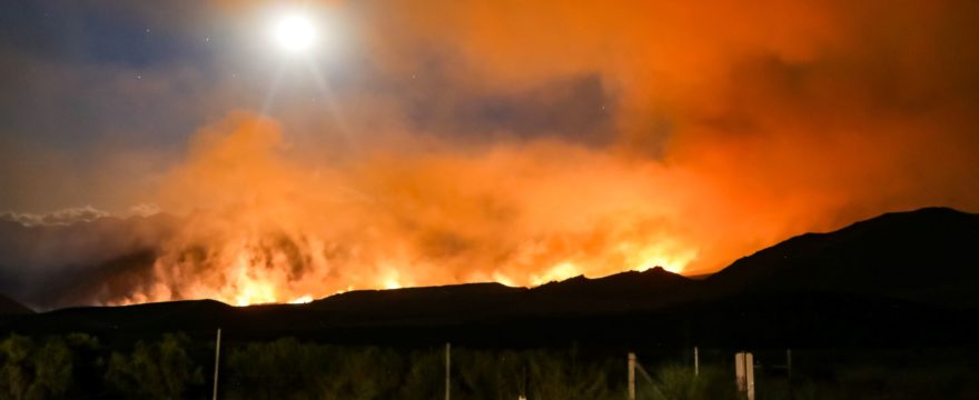
In the past few years, California has experienced an increase in both the number and intensity of wildfires. Why? Not surprisingly, the main culprit is climate change.
“More than half of the acres burned each year in the western United States can be attributed to climate change. The number of dry, warm, and windy autumn days—perfect wildfire weather—in California has more than doubled since the 1980s.”
–Scientific American
For environmental science or biology teachers, the California wildfires offer a very real, modern-day example of how climate change is affecting our land.
“While wildfires are a natural part of California’s landscape, the fire season in California and across the West is starting earlier and ending later each year. Climate change is considered a key driver of this trend.”
-Cal Fire Website
Climate change is just one of a few science topics that you can discuss with your class using the California wildfires as an example. Here are a few other topics you could cover:
- how fire can help maintain a healthy ecosystem
- why some seeds need fire to germinate
- how the California wildfires are affecting the giant sequoias
- the stages of regrowth after a wildfire
- how wildfire smoke affects the air quality
- how far smoke from a wildfire can spread
Basically, there is a lot you can teach about on the topic of wildfires!
2. Graphing Exercises
Each day that a wildfire is active, the acreage of the wildfire is posted on the Incident Information website. This provides the perfect dataset for graphing!
To see the list of 2021 California wildfires, visit the 2021 Incident Archive on the Cal Fire website. All of the wildfires are listed, with the most recent ones at the top. As of right now, there are 8,106 incidents for 2021…which gives you a lot of data.
While some of these wildfires were very short-lived, many of them make good datasets that you can use for graphing in the classroom. Using the steps below, you can have your students create a graph that demonstrates the acreage of the wildfire each day it was active.
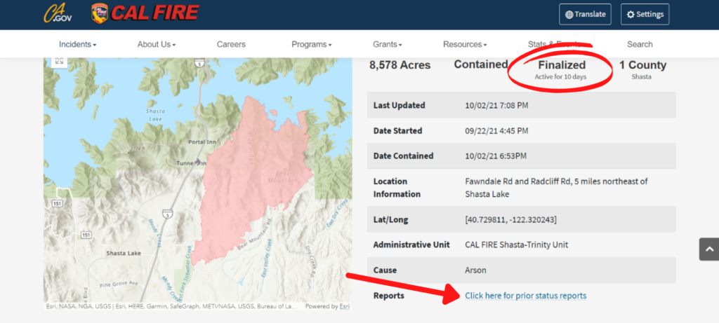
- First, select a fire from the list, or have your students select a fire. The first thing you will want to look at is how long the fire has been active. To make sure you have enough data for your graph, I suggest you try to select a fire that was active between eight and twenty days. For example, the Fawn Fire shown below was active for ten days. Ten days gives you enough data to create an interesting graph, without the graph being too large.

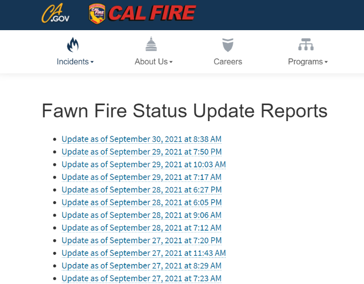
2. Once you have selected a wildfire to use for your graph, click on the link that says “Click here for prior status reports.” This will give you a list of the day-by-day statistics for the fire. Sometimes there are multiple reports per day. If so, just try to select the reports that are about 24 hours apart.

3. Next, click on each of the reports one at a time. Each of the reports will give the approximate size of the wildfire at that time, in acres. Copy down the wildfire size for each day. You now have a dataset from real data for graphing!
If you want to take the activity further, you can have each of your students choose a different wildfire for their graph. Then compare the graphs and see if your students can identify any trends in wildfire size, the growth rate, the number of days before the fire begins to downsize instead of spread, or other interesting details. Lastly, ask students what their biggest takeaway is.
If you enjoyed this post, click here for more free resources with real datasets.
